
Metrics are a very useful tool. They allow you to track variances in your application’s and infrastructure’s behaviour over time.
They allow you to see what’s happening, and to try and predict future trends.
They help you investigate during an outage to figure out which events lead to the problem at hand.
Once you’ve identified which causes have lead to the problem, a common solution is to add more detailed metrics to allow you to see in even more detail what is happening. Should a similar problem come up again, you’ll want to be prepared.
There’s a fallacy in all this. It’s the fallacy of too many metrics.
With every metric you add, you’re not done by simply tracking more data.
You need to:
- make sure the metric is visible and its meaning is documented and understood
- decide what to do whether this metric is critical
- figure out a threshold of when it is critical
- what kind of alert to send when the threshold is reached
- who to alert
- how to respond to an alert
With more metrics being added, business metrics too (think Google Analytics, cohort, retention, customer and funnel metrics), these decisions need to be made. If a metric isn’t worth alerting on, is it worth tracking in the first place?
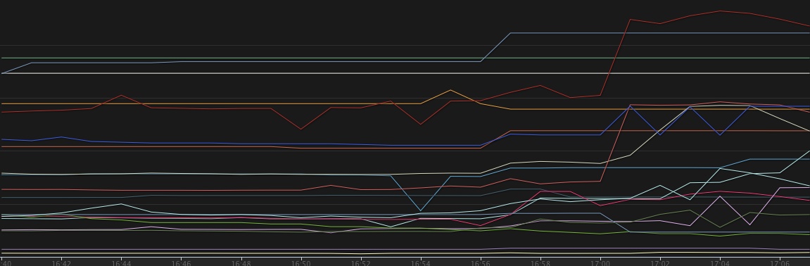
Humans are great at detecting patterns visually, but they’re terrible as monitors to constantly watch a pile of graphs. I don’t know about you, but I love pretty graphs, but I don’t want to watch them all day long to detect any anomalies.
Putting aside the fact that our current idea of graphs is far from being visually pleasing. I fondly remember Neil J. Gunther calling them “gothic graphs”.
Metrics increase the cognitive effort required to make sense of them. The more you add, the more effort a human or a team of humans need to put into extracting useful information from them. I highly recommend John Allspaw’s Monitorama talk on this topic and the follow-up post.
The answer, quite frequently, is simplification. A bunch of metrics get rolled into a more abstract value and that is displayed and alerted on instead. Unfortunately with simplification, nuances in the data get lost easily.
Add to that our very own biases that make us interpret the data in ways that let us find the simplest explanation, and you’ve got a recipe for disaster.
Monitoring and finding the right metrics are an ongoing process. Don’t be afraid to remove data just as you add new data.
Remember that as you add more information, you also need more cognitive power to process the data during daily operations and, more importantly, during the stressful times of an outage, when we’re most prone to our biases taking over rather than rational decisions.